
Project Summary
Design a mobile-first app where everyday consumers could purchase micro-annuities in order to save for retirement. The app’s primary feature as to offer a marketplace where average to low-end investors could buy into a portion of an annuity, an investment product typically geared toward large sum (i.e. $100k+) investors. Annuities products vary widely as an offerings but all essentially look to payout to investors as a low-risk investment hedge against running out of other retirement savings.
The app was a strategic pivot for the essentially the same company and team that I worked together with in Boston on the Track App at Track Information.
Second Half Finance app, May 2020.
My Role
As UX lead from Nov 2019 to July 2020, I was designed a mobile-first app/sales demo POC that we used to validate the product concept with business partners and potential investors. The POC needed to be aspirational in tone and polished visually as well as demonstrate the key workflows for customer on-boarding, selection and purchasing, summary and analytics. Social aspects, e.g. seeing how others in your demographic were investing in products, as well as more Venmo-like social sharing with friends and family were also considered in the MVP roadmap to encourage interaction and regular engagement.
Challenges
- UX Design = leaning-in and understanding the business. While annuities have been around for awhile in the insurance industry, insurers hadn’t yet offered them to entry by lower-end investors. We weren’t sure if we were even addressing a true market need, it had to be proven by a POC and startup work is often ambiguous. We began with what was knowable about annuity products, who the players in the space were, and who the buyers of these products typically were. It’s from this deeper understanding of the business that we realized that the Millenial demographic, younger people who had lived through deep recessions and rising higher education costs, were thinking more about their financial futures than perhaps past generations, and that there were few retirement products available to them other than traditional 401k’s through an employer or riskier investments such as the stock markets. Centering on these target users it was easy to deduce that they would prefer a mobile-first app that made purchasing transparent and easy, and the importance of building in social integrations both for the client’s needs and potentially for our own viral marketability.
- A shorter timeline to MVP. Since we had invested a lot of time and resources into the Track app the decision to pivot came with a tighter timeframe to produce a polished and functional POC, and show value to investors. Knowing that we didn’t have many cycles to burn or resources to spare focused efforts and refined our process. We talked about what worked and hadn’t worked so great in the run-up with Track, worked at getting more Lean at UX which allowed us to iterate faster, work more effectively and methodically, and produce a solid MVP demo app to help our execs make the business pitch.
- New people, new processes, and learning to accept and expect the unexpected. As we began to pivot we added new people to the mix: New engineers and business leads who came with their own opinions and way of doing things. While change is inevitable I saw again how adding new people and personalities, the ambiguity of what we were building, and overlapping roles and responsibilities began to play into progress. Even as the fresh ideas and insights poured in, our existing process began to noticeably slow, and breakdown. And in startups I’ve learned after working for more than a dozen years in many, are a life lesson in learning to expect and accept the unexpected and be able to make a turn for the better. We had strong leadership, a steady and growing lineup of funding, partners, and investors, and plenty of runway. But then the pandemic happened and no amount of good will, planning, and good process mattered. The saying goes that the only constant in life is change, and doing our best to roll with it is sometimes all we can do.
Second Half Finance, May 2020
Solutions, Results, and Lessons Learned
- When process starts to falter, look within. It’s all too easy to look at others as a source of problems rather than ourselves and what I realize matters most is a flexibility and openness to recognizing and acknowledging that something’s not working, a willingness to discuss the problem in good faith and view opinions fairly, a need to accept our own biases and misgivings, to put aside ego, and work through the difficulty together that’s most important to bring about change for the better. Be professional, honest, and participatory when processes aren’t working, and provide your input and insights on the process as it evolves. It’s these factors that help a team thrive and survive vs. stagnate or become apathetic Cogs in the Machine.
- A MVP demo app that helped secure funding and partnerships. The POC we created was a hit with our investors, and perhaps equally as important, partner insurers who were willing to back the new product offering and marketplace concept. The polished and functional prototype was so convincing that it began to turn into a FOMO matter for some who mistook it as being proof that we were further ahead in developing the product than well, we actually were. Where insurance is a highly competitive business we were not sure whether big brands like Prudential or AIG and their pricing models laid bare alongside lesser competitors in a marketplace. In fact, these established giants of Insurance saw brand awareness as a huge factor especially in courting a younger demographic still heavily influenced by the retirement savings decisions of their parents (Gens X, Y, and Z) and grandparents (Hey Boomer).
- Design artifacts like Journey Maps and Personas are living documents and do not necessarily need to be started from 1st person user research. As a former journalist, and in my many past experiences working with top usability experts at Lycos, Forrester Research, Endeca/Oracle, Monster and Randstad, as well as having planned and executed my own research at numerous startups, this took some convincing as it went against my being to not get direct qualitative details first-hand from actual users, quantitative data (numbers, corroboration) and then deduce facts and composites that captured the demographic detail, emotion, personality, wants and true needs and made these users real to us. But because we were no existing products or market, we chose to use our collective knowledge business front and center, 2nd reference surrogates who knew the insurance business and its markets, and we surveyed friends and family to create the initial journey maps and personas. This choice while somewhat unprecedented by my standard made sense — artifacts should be living and serve a greater, unified understanding of our users. It made choices less subjective and ambiguous as we narrowed our scope, and to focus on our target customer rather than our ourselves. And as we gained traction with insurer partners many assumptions were validated and held true. We also promised ourselves to revisit these regularly, not just some dusty artifact to be one and done with.
Second Half Finance, Dec 2019
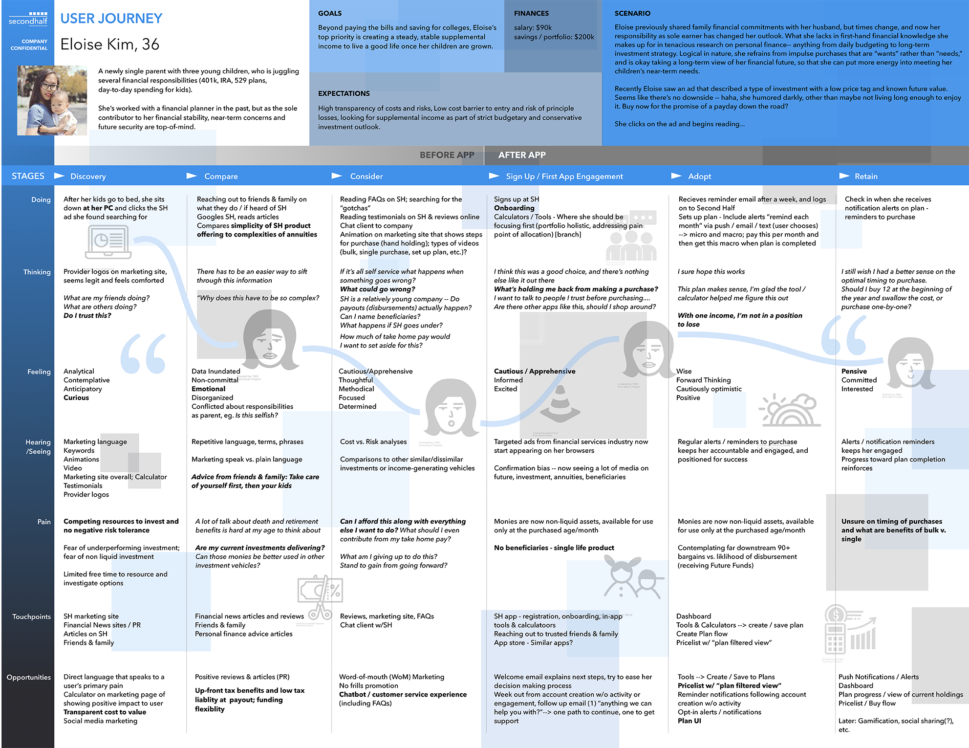
Sample journey maps for Second Half personas: Eloise Kim (PDF) and Chris Gonzales (PDF).
Second Half Finance, May 2020.
Complete MVP design of the Second Half Finance App, May 2020 (PDF)