Project Summary
Design, build, launch, and support a global, multi-brand design system for product designers and developers to decrease production time and time to market, and increase efficiency, consistency, and the overall quality of the user experience in major brands like Monster and Randstad and their sub-brands and operating groups, e.g. Service teams within Monster like Monster’s Government Services (MGS) and Monster’s Strategic Talent Services (MSTS), or Randstad sub-brands such as Tempo Team, RiseSmart, and SourceRight.
The design-to-code design system we built was unique in that it leveraged a custom parser and an automated pipeline to take design assets created in Figma to power a React Web component library. This gave designers brand-ready design assets to use in mockups and prototypes, and engineers got ready-to-use components they can use in ongoing project work.
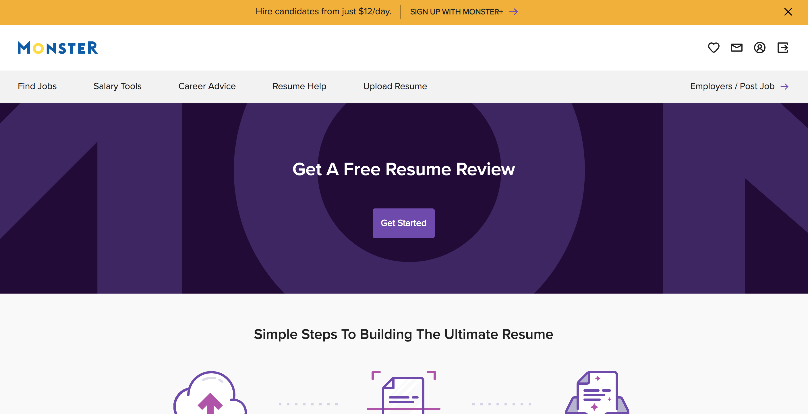
The design system project was part of a total tech transformation strategy led by Monster Worldwide, a wholly-owned subsidiary of Randstad from 2019 to the early winter of 2022. At the end of 2022, new leadership at Randstad pulled back from the integration with Monster, and the design system project was consequently scaled back to serve Monster brand and its sub-brands. You can see much of what we built for Monster here in Storybook. Components here are driven by our custom parser nicknamed, Style Forge, which you can find here (Git Repo) when it was open-sourced in the Spring of 2023.
My Role
As the design lead for the design system from July 2020 to Aug 2023, I directed our approach, managed our communication and design work, and was responsible for making foundational decisions about the system, such as deciding to go with Figma (over Adobe XD or Sketch) because of its multi-player features, innovation in the design tooling space, and code-ready API that matched with our mission.
My role was largely Design Ops role in an integrated squad, and we operated like a startup team, investigating different paths towards our goal, and always looking for better ways to do things. In this role I wore many hats — product designer, design manager, product manager, teacher, counselor, or researcher — on any given day. We worked in a continuous release and feedback model that informed decisions and enabled us to continuously adjust to our user’s wants and needs.
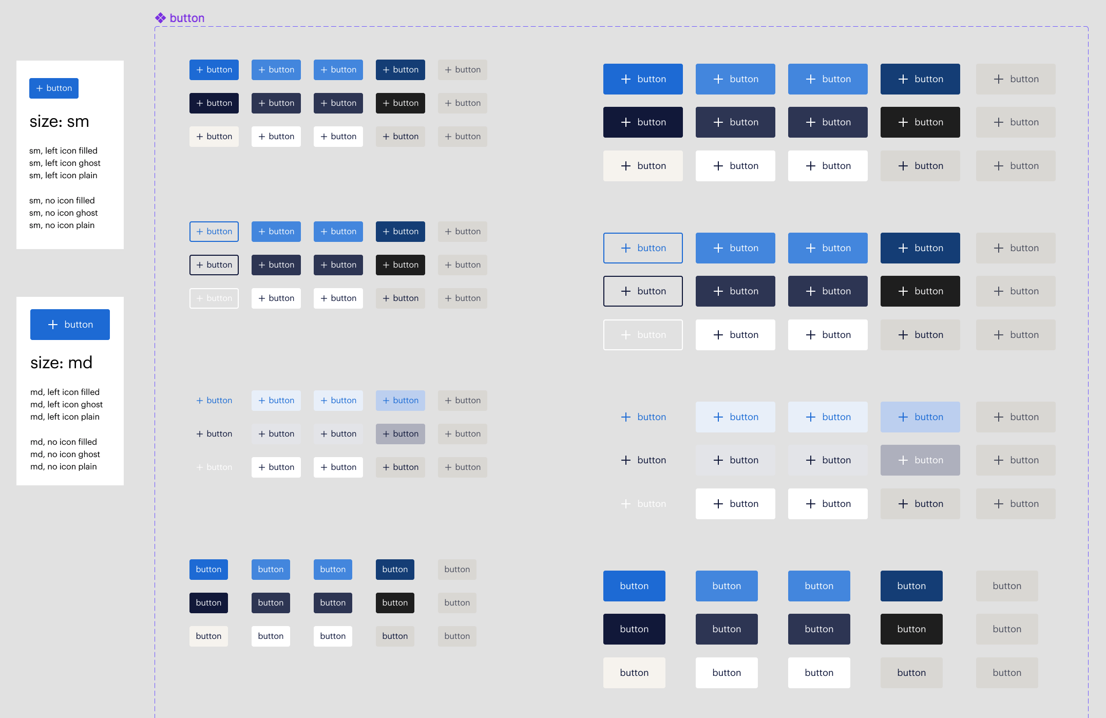
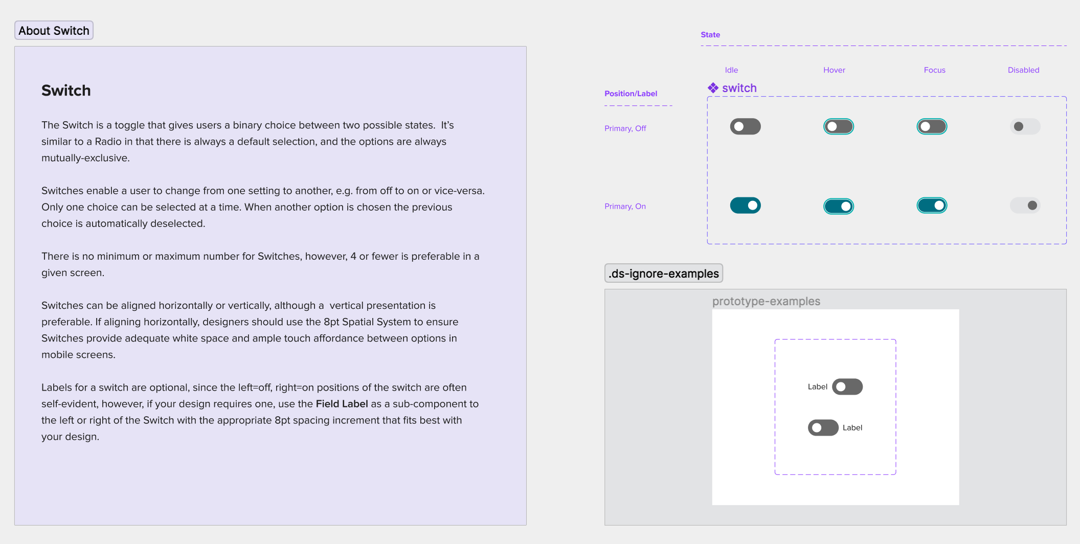
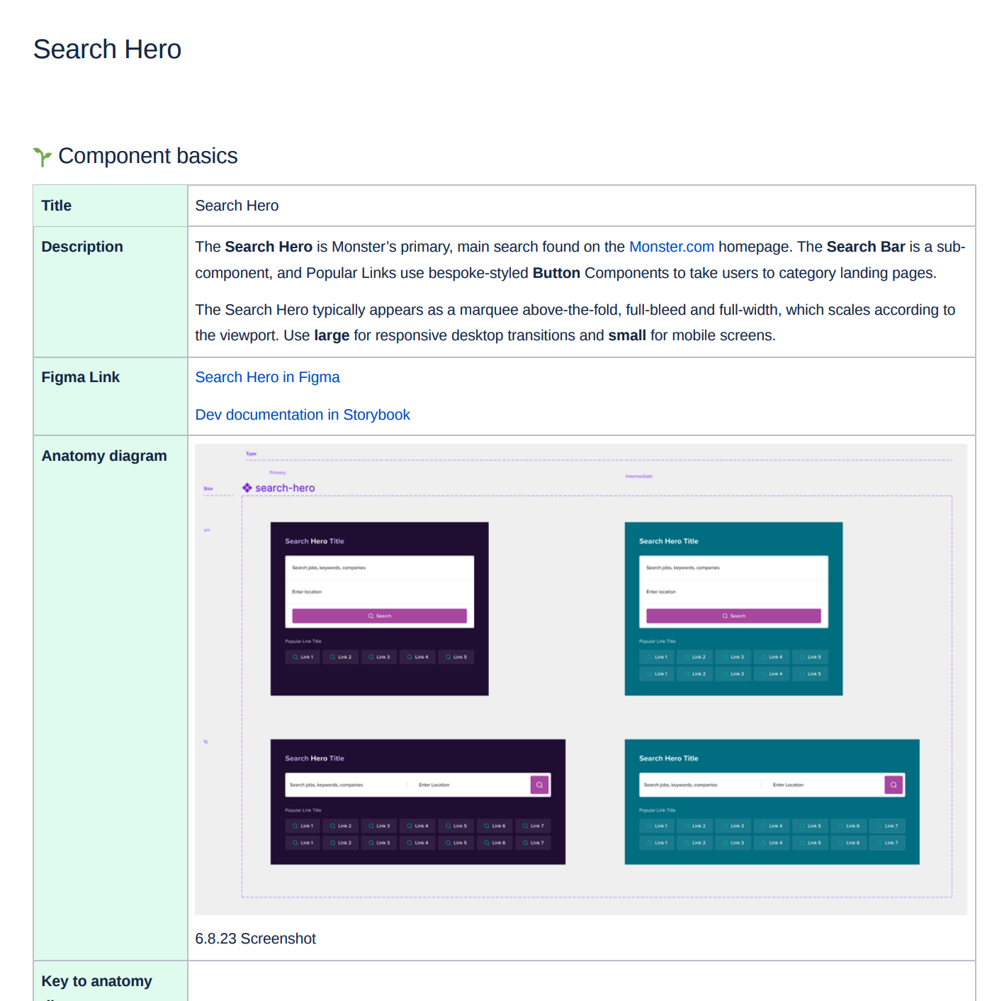
To meet the codebase requirements, we designers had to be flexible and more methodical in our process. In addition to collaborating regularly with our our target users, we paired early and often with our Dev counterparts create components that worked for both designers and developers. A specific “design-to-develop” contract evolved to ensure what we designed would work for a designer, but would also produce valid theme data that would not cause breaking changes in our codebase.
Regular check-ins with users supported engagement and the adoption path as we worked together to find answers and a balance for everything we built. Components needed to meet expectations for ease-of-use, be consistent and predictable, directional and guiding, but also flexible enough to allow for creativity and ideation. To support what we built I also was in charge of writing all of the design documentation on how to use the system, as well as best practices and guidelines for components, in a combination of Storybook, Confluence, and Figma.
Tech Writing Sample: Design System (D2D) Design-to-Development Contract (PDF)
Challenges
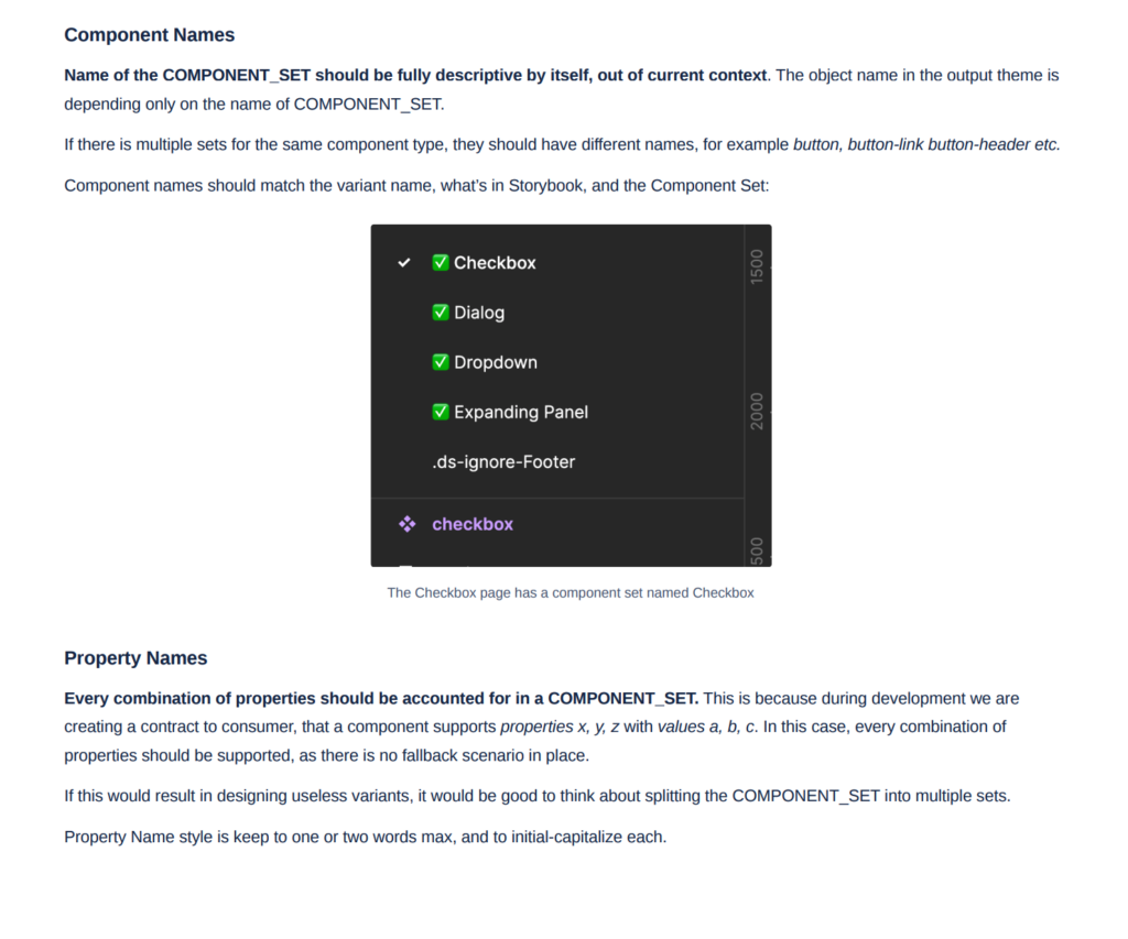
- What’s in a name. When you’re designing a universal system, coming up with a common lexicon and naming things correctly is vitally important, not just to facilitate communication but because changing it later becomes increasingly hard once its out in the ecosystem. To name things accurately we took the time to regularly survey other systems, discuss our collective experience in front-end, and payed homage to what terms were already in use by our target audience. We also paired with our developers early in the design process building components to ensure name-value pairs for property and attributes were parallel, and made sense to end users as well as what developers would eventually build.
- Designing a system that can accommodate multiple brands. It was also a challenge meeting universal requirements for the wide variability user expectations about a given component. How someone expects a component to look, work, and behave was generally aligned but subtle differences can be subjective, meaning works for some may not feel right for others. After exploring our options our approach was to build solidly-foundational and minimal components that were directive and prescriptive of the brand. And while intentionally limiting to ensure UX consistency, they were flexible enough to change to meet user’s expectations and enable creative ideation.
- Proving value amidst competing design systems. As the project kicked off we were already well aware that we had to build trust in our ability and purpose, and overcome reservations about current and past design system initiatives. Randstad already had an excellent design-only system, Orbit, and meanwhile at Monster, at least two other design systems had been started but only partially launched leading some potential converts with questions and concerns as our system came into focus. Convincing others to choose consistency and process over autonomy and action takes time, transparency and openness about what we were trying to build and why. We emos, talks, discussion, and the wherewithal to train and evangelize to build confidence in using the system over custom, and usually non-reusable creations.
Solutions/Results & Lessons Learned
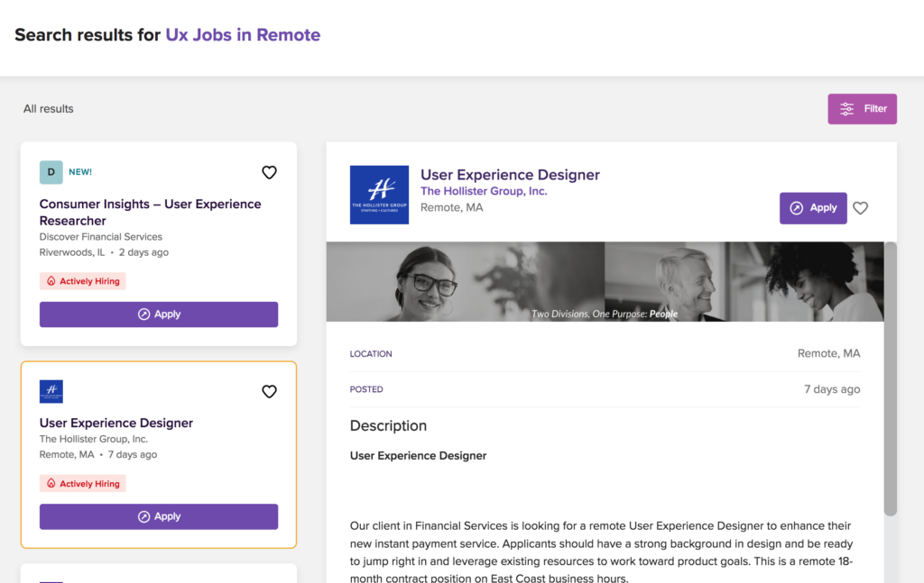
- Adoption is a continual work-in-progress Engagement with the design system has ebbed and flowed, ramping up and down with various projects, people and teams. The system continues to drive elements of the experience but not all of it and experience-wide adoption remains the ultimate goal through an ongoing process of training up, breaking things down, and continuing to evolve the system meet changing user needs. At Monster for example, the header and footer on the homepage of Monster.com, as well as the job cards found in search results use the system but unfortunately it doesn’t drive the entire experience of either the homepage or jobseeker search. The good fight goes on.
Lesson Learned: News Adoption takes time and consistent effort on the behalf of creators. You have to have a growth mindset and not be afraid of ambiguity, be ready to change and help shape the future of the experience. There must also be a willingness to set aside egos, as well as tenacity and patience to teach, train, and partner with end users early and often until everyone’s on the same page about why a design system is a better choice than the inefficient alternative: Custom design and code over and over again, for what should be the same user experience. - Success lies in what’s next for the product. We learned early on that you can build and rebuild components, styles and patterns in the pursuit of perfection but what gets system components in the live experience is aligning with what’s upcoming for release.
Lesson Learned: Start zeroing in on what’s upcoming on the product roadmap and design to those use cases. Ask ahead be part of the regular product design and requirements review sessions, so you can see what’s coming down the pipe and align system work to line up with upcoming product release. Does the system provide an answer to a particular UX problem already or does it speak to something new? By tying the system to tactical initiatives in the product roadmap, system creators can make the case for universal utility, relevance, and efficiency.