
Project Summary
UX design for a product that sought to bring Big Data and Predictive Analytics to everyday consumers so they could control and track all data in their lives via a single app: Money, Health, Home, Auto, Travel, and more.
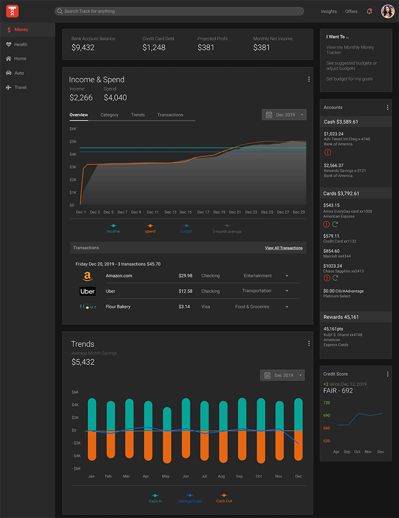
The Track (Information) app sought to consolidate all data streams from your favorite apps, E.g. Banking apps Venmo, credit cards, and Health/Wellness apps like Fitbit, Oura, Garmin, Strava etc., and provide users with analytics and insights, and deals improve or change their lives and behaviors for the better.
For example: “You’re spending $58 a week on a skim mocha lattes at Starbucks coffee. Would you like to buy this Starbucks $25 gift card through Track at a 10% discount and save on your favorite cup of joe?”
Track App Section Pages in Both Light & Dark Mode

Track for Web landing page and workflow concepts in both light and dark mode (pdf)
My Role
As the design lead from May 2018 to Nov 2019, I joined Track in the very early stealth startup phase and inherited a Web responsive design from a friend/colleague who had begun early work on the concepts and foundational design. After joining my friend shifted to focus on art direction, marketing and brand identity while I picked up the Web UX where she had left off, and also began designing out the mobile experience. This included UX research, evolving the end-to-end experience with our integrated product team, and beginning to apply visual treatments Our process involved frequent review and feedback sessions with stakeholders, product and engineering, and eventually, reviews and studies with our target users using interactive prototypes created initially in Axure Pro, Sketch, Adobe, and InVision, and defining the design specifics in Zeplin for our Dev team.
Challenges
- If we build it, will they come. We knew we had accepted a massive undertaking to build an app that would give consumers the ability to control of their own data and uncover insights about themselves towards improving their lives. We also had to contend the fact that big companies like Google, Apple, and Facebook, etc. had already raised the profile of the privacy and use of personal data issue. Big Data was still abuzz in many people’s ears, and GDPR was top of mind for many. We simply did not know with any certainty whether there was actually a market for the product, who the potential users might be, and pondered whether we had bitten off more than we (or our possible user base) could chew. Could one app really do it all where so many already in market had a big enough challenge focusing on just one thing well? And if we built it, would anyone use it over those many individual apps?
- A roadmap that was a mile long and an inch deep. We were building an all-in-one-app for the masses, but had limited time and resources to make our mark. So we had to decide to focus our efforts and resist an effort that tried to be too broad and unfocused. We finally landed on the areas of Money, Health, and Home, would be our focus because of the concentration of apps already in market for Money and Health, and Smart Home tech was being adopted by average consumers. These became our focus for the POC, as we grappled with still larger issues like: How were we going to make money on a free data app for consumers?
- Designing for Web first then Mobile, light and dark modes. Since we had started with Web first, designing down to mobile from the larger form factor proved more challenging than I had first expected. This work involved going back to our foundations, paring functionality down to essentials, designing for touch, and limited screen real estate meant modeling different interactions, building in affordances for additional or fewer screens or details.
Moving from light to a dark mode as we moved towards mobile was a must due to its popularity, and expectations of our target market (Millennials), but became a study in how doing so also demanded a return to foundations, and is not as simple as flipping a switch. I needed to look at how we were using color holistically, and how light or the lack of it affects human perception, levels, and hierarchy. How color and contrast interplay with elements of light and shadow, hues, luminosity, branding, culture, and UX.
Track Information, Aug. 2019

Solutions/Results/Lessons Learned
- Web-based and mobile interactive prototypes. While I was able to produce several working interactive prototypes for each experience, we should have started with mobile first. Starting with a smaller form factor proves easier, as it forces the design to make hard choices, often revealing the essential UI needed for success.
- Too ambitious? In the end analysis we found we were “boiling the ocean” by trying to build an all-in-one consumer data app that integrated business intelligence and predictive analytics was a massive undertaking. The breadth and depth of any one vertical, e.g. Tracking all of someone’s money was monumental alone. This immovable fact, coupled with timing and resources, growing consumer angst and awareness of how big tech was perhaps (mis)handling their personal data and how this might affect trust, and our model to positive revenue was still murky. As we soberly assesses how far we’d come and where we still had to go we saw many more months if not years before critical mass. and leadership made the pivot to begin work on, Second Half Finance.
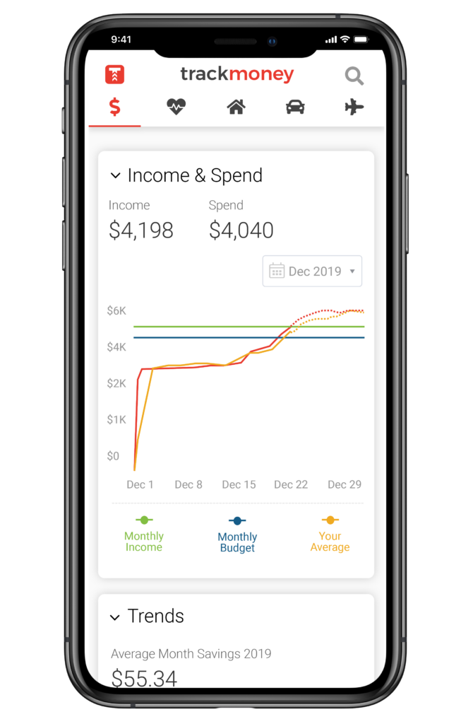
Track MVP mobile experience screens and featured verticals, modules (pdf)