Project Summary
Salsify helps business customers manage and publish their product content, when, where, and how it’s needed by various channels in the digital supply chain.
The projects I worked on included designing a MVP customer dashboard that could begin to provide analytics to help customers understand the status of their product content’s readiness for publication and bring them to completion, an app template redesign to for responsiveness support for tablet form factors, and integrating UX best practices such as building a space for design in an agile workflow, conducting usability research, and creating personas.
My Role
Salsify was an app that was designed by engineers, and as the first product designer hired at the early startup stage I was tasked with bringing in UX best practices to the experience such as basing our design decisions on requirements, and conducting field research and contextual inquiry with client customers and key stakeholders. The was no product management at the time I joined as leadership drove priorities through the tech team, and the tech team which was working in agile had never worked with designers. So my role also included figuring out out to integrate design into that workflow in being tasked to improve core features and functionality. The top feature enhancements I worked on included:
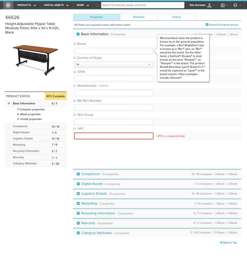
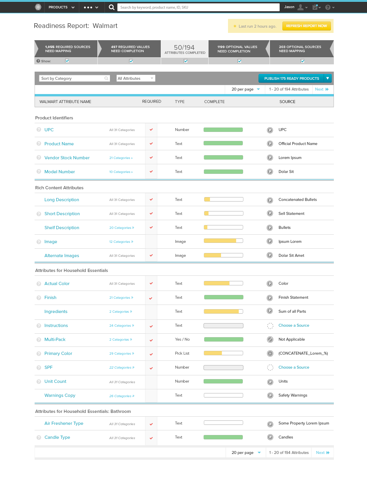
- A MVP Dashboard a.ka. Readiness Reports – Created the first versions of a status dashboard to help users get a detailed status of their product’s states of readiness for publication to retail channels, find where gaps in property data still existed, and how to fix them. These details existed at a granular level but there was no method that provided customers with an overview that allowed them to easily see problems, triage, and then complete the necessary requirements for publication.
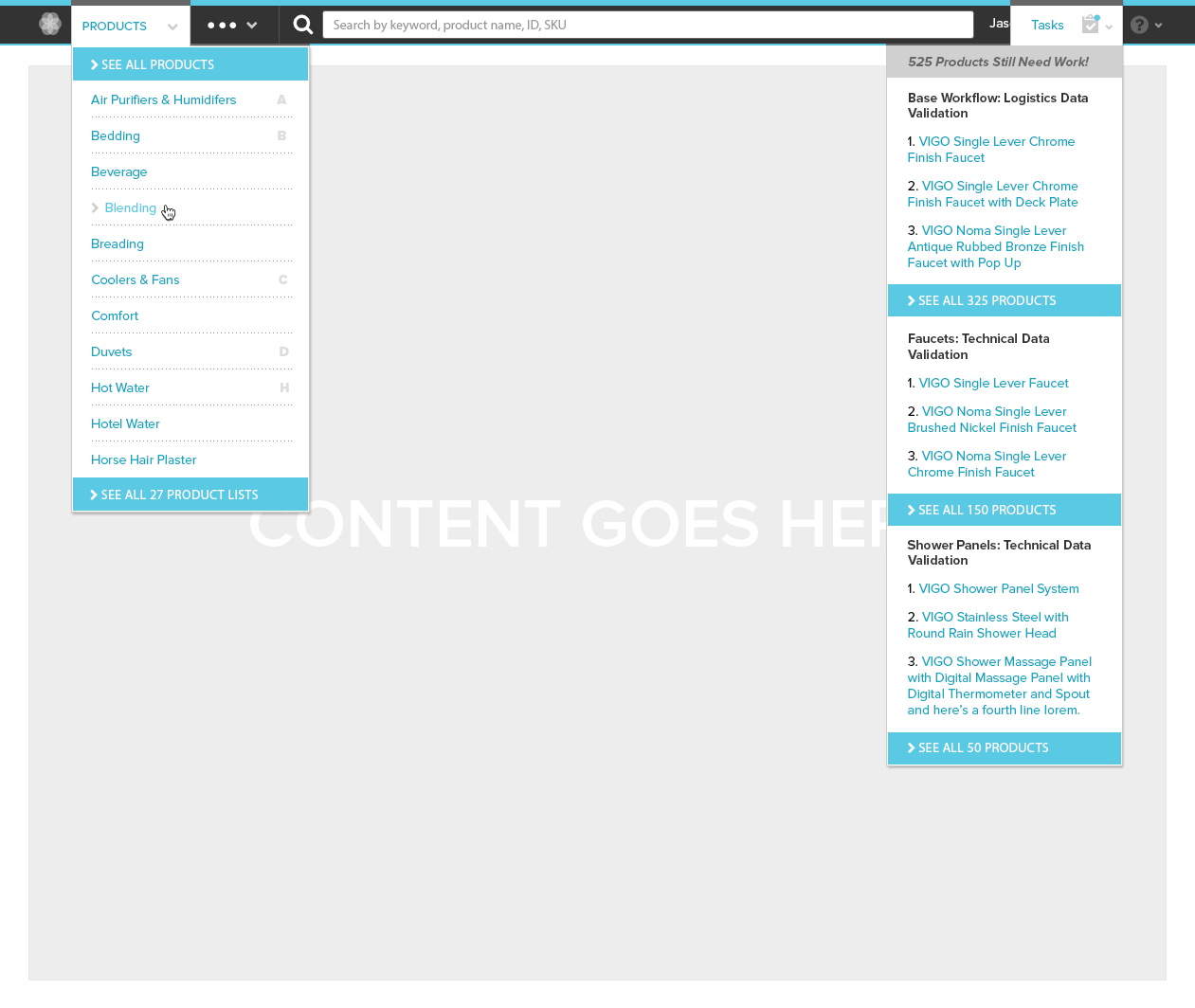
- Responsive app redesign – Updating the main app to be responsive to tablet (not phones) by moving from a wasted space left-column navigation bar to a compact thin, “skinny” header that included reworking and restructuring, the UI’s navigation.
- Designing in agile, user research, persona creation – I worked with the team to integrate design into agile since the strict agile workflow does not account for design cycles to be woven in to its existing process. I kicked off a UX practice within the company by working to understand the business, and its users by building client relationships so I could understand their business drivers, and I developed personas to focus, educate, and communicate and the team about our user’s true wants and needs.
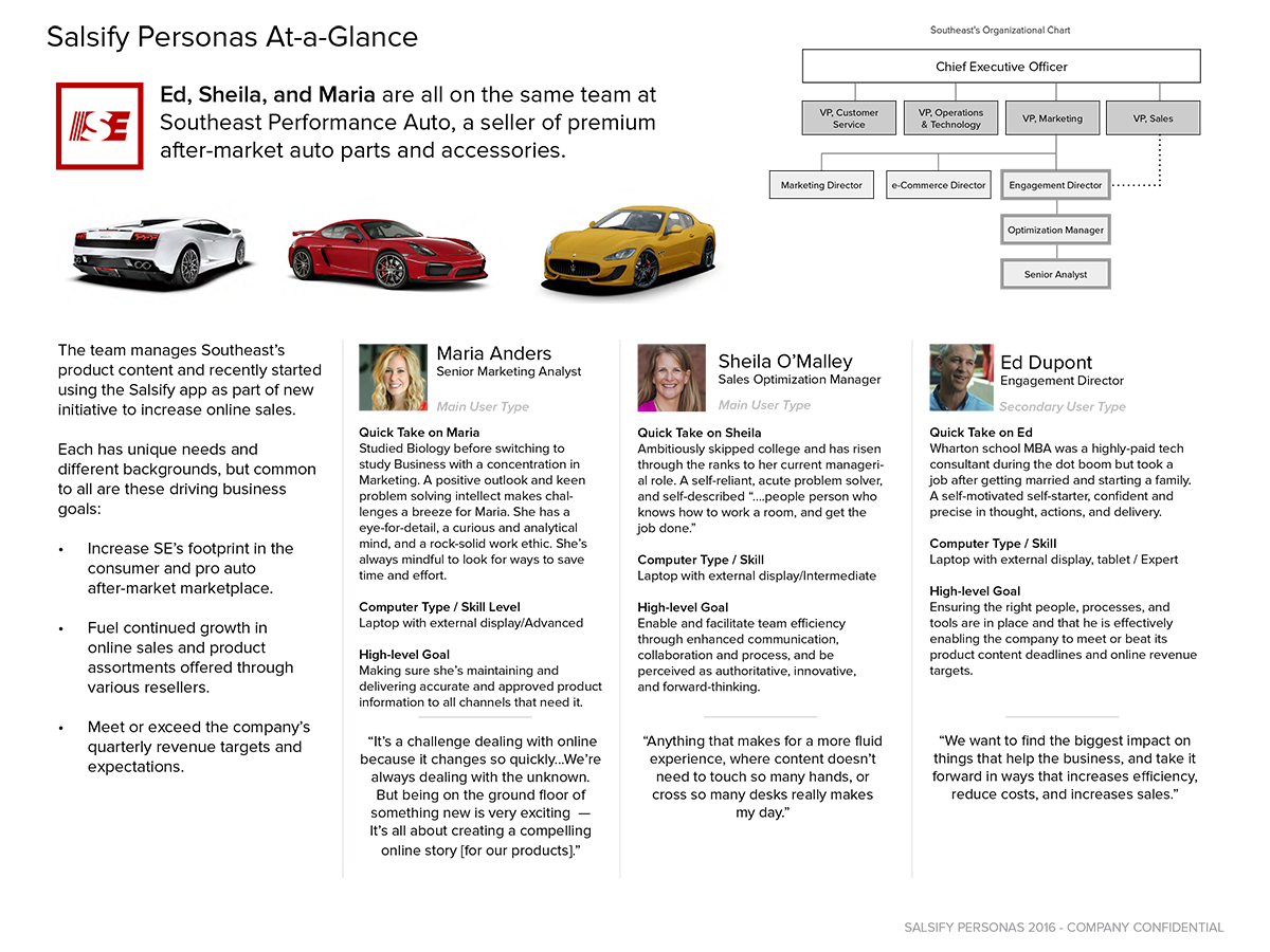
Sample UX Research: Salsify Personas (PDF)
Sample Usability Report: on Target Schemas aka Readiness Reports Apr 2015 (DOC)
Sample Discovery UX research for enhancements to the Readiness Report feature Oct 2015 (PDF)
Challenges
- Few requirements and few client customers. The team knew that users were struggling with trying to determine the various states their product content was in and research uncovered multiple workarounds to get the details the needed they needed to get to completeness, but it was hardly ideal. What was clear is they needed a way to get immediate at-a-glance status of their product’s states of readiness for publication to retail channels, find where gaps in the schema data still existed, and how to fix them. We were so early stage that there were few clients available to glean discovery insights from to drive requirements, and building those relationships and understanding the business pain was the key to start finding viable solutions.
- A desktop-first app. The team had heard early on from users (many of them based in their company’s marketing teams) that the app was not tablet-friendly or responsive. Mobile first design was a growing mantra in tech, and everyone wanted the Web app to be “more app-like” and to address the lack of responsiveness at least for a tablet form factor. But the app had based itself upon being able to import and digitize products tracked in massive excel spreadsheets and didn’t naturally lend itself naturally to condensed displays or scalability. Issues of usability, the visibility data required horizontal scrolling which affected a user’s ability to maintain orientation and work effectively was cumbersome and difficult. We had to think up new paradigms for layering different elements of data, to enable the power and flexibility of working with dense tabular data native to spreadsheet apps and augment the value of the content being digitized and not just being a powerful online spreadsheet app.
- An Engineering v. Product-Centric Thinking. Because the product had been founded by a team of talented engineers and there was no product management or unified road map synthesizing or scheduling requirements, so weaving design into a strict dev-centric agile workflow was a first. There was also low enthusiasm slow down development to integrate design with process changes, and low UX maturity within the org which meant needing to also prove that UX practices could help the product progress.
Solutions/Results/Lessons Learned
- Agile meets Design and a path forward. The agile workflow is amazing for its ability to be able to break down tasks into size-able chunks that make work manageable and project scope visible, limit risk, and a continuous stream of measurable development. But the process itself doesn’t naturally include cycles for design (and in some cases for a dedicated team doing quality assurance) to do the work informing the coding in parallel. As we worked on design initiatives, and through trial and error we figured out that design could follow its own agile process flow, but really needed its own lane and that design needed to be complete and approved 1-3 sprints ahead of the start of dev work on a given feature. We realized that design could not start within the same sprint that dev needed the design to follow. This realization was game changing in providing enough runway for design to be completed before development started, and built in room for iteration and approvals, so development was not building against a target that was still in motion.
- MVP Readiness Report client dashboard. We delivered a first version dashboard that received positive feedback from our client base for their most vexing problem of ensuring their content matched schema requirements for publication. It demonstrated what UX could do for the product, began building the street credibility with the team for the value of good UX, and I was able to begin building relationships with clients and trust that we were actively listening to concerns and acting on it.
- Responsive App Redesign. We delivered responsiveness and navigation enhancements to support a tablet form factor by opting to move away from a thick left-sidebar styled navigation template to a unified thin or “skinny” header that was more extensible and user-friendly on various sized devices and resolutions. We made the app more app-like, improving navigation (re-organized menus and taxonomy), as well as the visual and interaction design (e.g. look-and-feel, iconography, transitions). We also opted to soft-launch the changes so it wasn’t a hard switch for customers, allowing them to switch between the old and new interface for several weeks before cutting them over which helped gain more feedback while it was in use in order to acclimate them to the changes and make a list of future improvements.